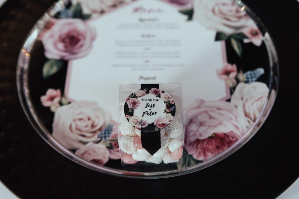
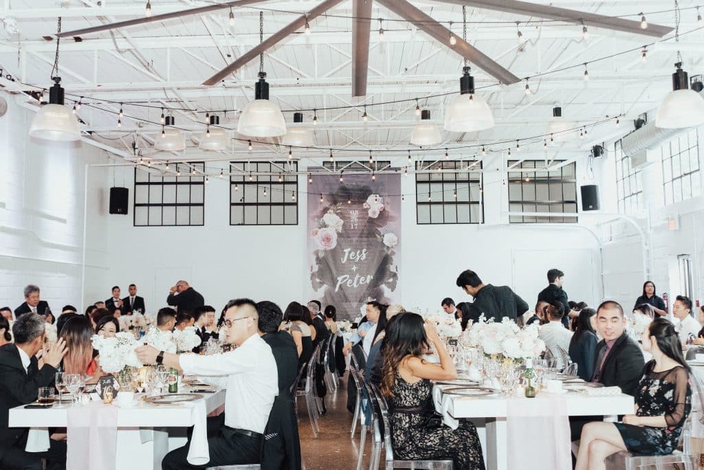
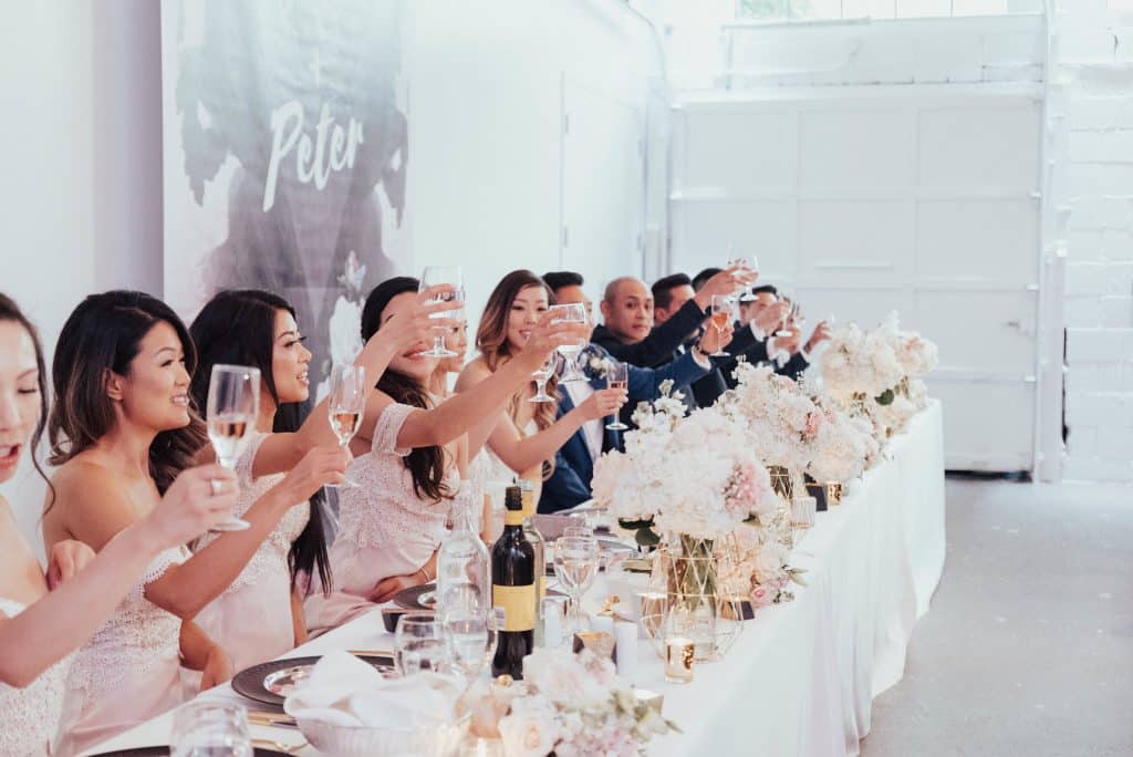
We knew we wanted pops of black with the blush and white, and they wanted the table to have a full mix of different elements. We found a slate charger that framed the menu perfectly, giving it a slight masculine feel to contrast the floral on the stationary. Gold flatware was used to give it a pop of luxury. The geometric floral vases sat atop a hand dyed blush table runner that the bride’s mother made. It made for a soft texture juxtaposing the modern feel of the white table and the hard edges of the geometric shapes. The groom spent many nights creating their own geometric cement candle holders that they painted gold, to give another dimension to the table.
The chairs and tables provided a modern and clean backdrop to the busy elements that juxtaposed them. The clear chairs lining the ceremony served as a perfect canvas for a continuation of the floral graphic. We decided not to create this for every chair, but just the ones down the aisle for dramatic effect.


